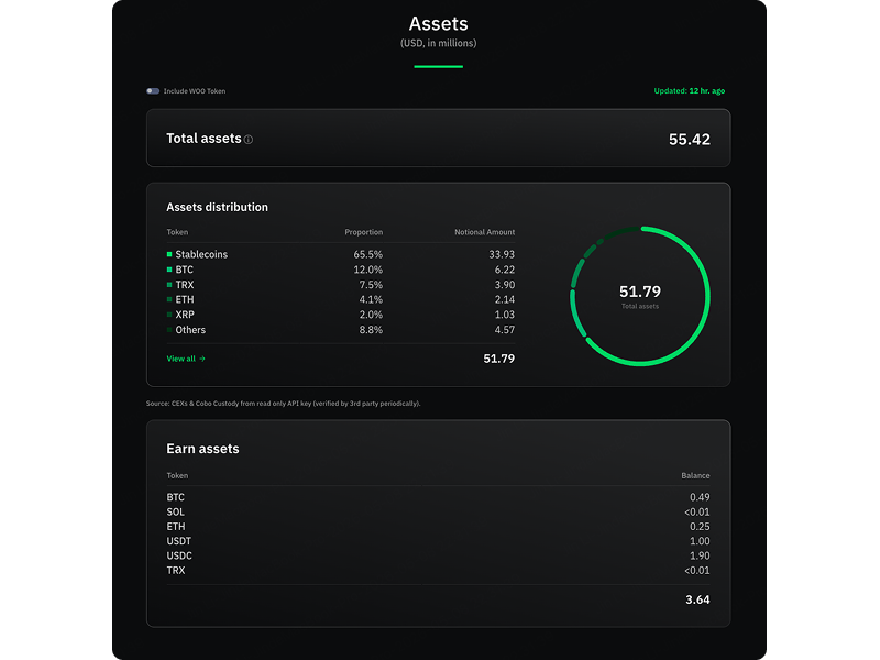
Live Balance Sheet Data
Dashboard
Internal security audit-log tool for compliance teams.
In a proactive response to calls for transparency among digital assets exchanges, WOO Network launched a real-time reporting of its assets and liabilities — the first in the industry. In light of the FTX exchange collapse, numerous crypto exchanges began disclosing their asset-liability information. With a 3-week target timeline, I led the end-to-end UX/UI design of a transparency dashboard that updates every 15 minutes, covering live asset/liability data and proof of asset holdings.
Role & responsibilities
Data Architecture
Quickly organized WOO Network's asset combinations into a user-friendly structure to form the foundation of the balance sheet.
UX Flow Design
Designed the information architecture to make complex financial numbers intuitive and scannable for all users.
Development Handoff
Established development specifications integrating the existing web design system. Full design-to-handoff completed in 1 week.
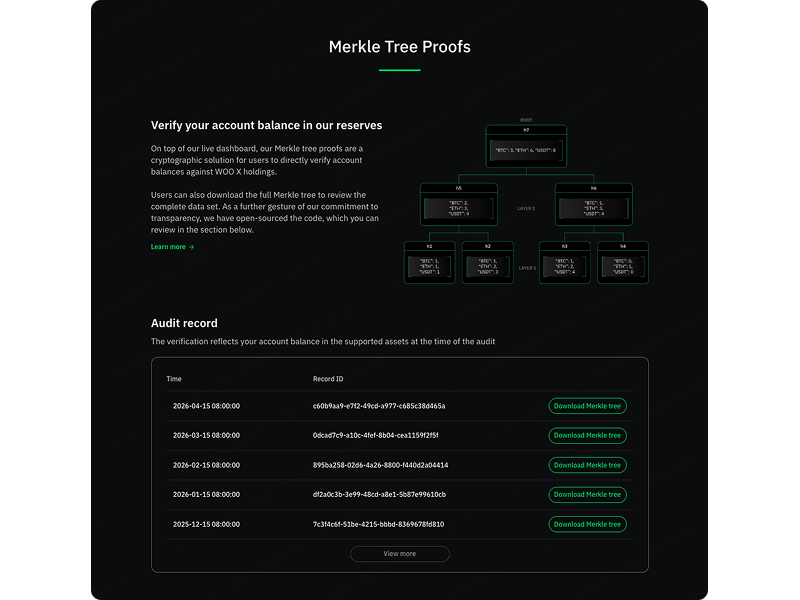
Phase 2 — Merkle Tree
Designed on-chain Merkle Tree verification, allowing users to independently verify their asset holdings on WOO X.
What we set out to achieve
Restore User Trust
Launch a transparency dashboard in response to the FTX collapse and rebuild confidence in the platform.
Real-Time Data
Display asset and liability data updating every 15 minutes to give users accurate, live information.
Data Clarity
Transform complex financial data into a readable, user-friendly format accessible to all users.
On-Chain Verification
Enable users to independently verify their assets through Merkle Tree proof in Phase 2.
Understanding the landscape
Key Insights
- →How to present complex financial data in a way that non-expert users can understand?
- →How to design a live-updating dashboard within a 3-week timeline?
- →How to build an on-chain verification UI that feels accessible?
Key Findings
- How to present complex financial data in a way that non-expert users can understand?
- How to design a live-updating dashboard within a 3-week timeline?
- How to build an on-chain verification UI that feels accessible?
Design decisions
Live Balance Sheet
Designed a real-time transparency dashboard updating every 15 minutes. Starting with rapid data collection, I organized asset and liability combinations into a clear information hierarchy before building the UX flow and finalizing the UI using WOO Network's web design system. Design and development handoff was completed within 1 week.
- Real-time updates: Balance sheet refreshes every 15 minutes with live asset and liability data.
- Asset proof: Clear disclosure of where assets are held, building user confidence.
- Data-friendly layout: Complex financial numbers organized into a readable, scannable format.
- Design system integration: Built on WOO Network's existing web design system for rapid development.
Phase 2 — Merkle Tree Verification
Following the positive reception of the initial launch, we designed a Merkle Tree verification system as Phase 2. Users can independently verify their individual asset holdings on WOO X using cryptographic proof, adding a deeper layer of transparency.
- On-chain verification: Users can verify their assets directly from WOO X using Merkle Tree proof.
- User-driven transparency: Empowers individuals to independently confirm their holdings without relying solely on platform disclosure.