Growth Initiative
Design
Systematic growth design for a crypto trading platform — building an A/B testing framework and bi-weekly experiment cycle.
The Growth Initiative is a structured, continuous design programme where the growth team proposes, designs, and ships UI/UX optimizations every two weeks. Rather than large, infrequent redesigns, this approach prioritizes small, high-impact changes that compound over time. Every sprint ends with a tech review, performance data review, and a new batch of experiments queued — keeping the team accountable to metrics, not opinions.
Role & responsibilities
Data Review
Analyse funnel data, identify drop-off points and high-leverage optimisation opportunities each sprint.
Design & Propose
Rapid prototyping of UI/UX changes. Proposal deck with success metrics defined upfront.
Build & QA
Engineering implements approved changes. Designer QA's every pixel before release.
Ship & Track
Changes go live. Performance data is tracked for 2 weeks before the next sprint review.
What we set out to achieve
Improve Conversion
Improve conversion and product engagement with small, focused UI/UX optimizations delivered continuously.
Compound Small Wins
Each change is scoped to be shippable within a 2-week sprint. Compound small wins into measurable metric improvements quarter-over-quarter.
Tech-Aligned Process
Propose new changes every sprint with full tech review — design and engineering aligned from day one.
Evidence Over Assumptions
Track performance data on every shipped change. Build a shared culture of experimentation across PM, design, and engineering.
Understanding the landscape
Key Insights
- →Sprint 03 — CTA Copy & Hierarchy: Replaced flat grey buttons with high-contrast orange CTAs and action-oriented copy. +1.8% CVR.
- →Sprint 05 — Empty State Redesign: Transformed dead-end empty states into conversion moments with direct CTAs. −12% Bounce.
- →Sprint 08 — Deposit Flow Simplification: Reduced 3-step flow to 2-step. Data showed 42% drop-off at Step 2. +34% Completion, −28% Drop-off.
- →Sprint 09 — Hero Banner A/B Test: Reward-first copy vs product-first headline, 24,000 users. Winner: 'Get $10,000 to trade risk-free.' +1.7pt CVR.
- →Sprint 11 — Personalised Push Notifications: Replaced generic templates with context-aware messages tied to each user's journey stage. +7.5pt CTR.
Key Findings
- Sprint 03 — CTA Copy & Hierarchy: Replaced flat grey buttons with high-contrast orange CTAs and action-oriented copy. +1.8% CVR.
- Sprint 05 — Empty State Redesign: Transformed dead-end empty states into conversion moments with direct CTAs. −12% Bounce.
- Sprint 08 — Deposit Flow Simplification: Reduced 3-step flow to 2-step. Data showed 42% drop-off at Step 2. +34% Completion, −28% Drop-off.
Design decisions
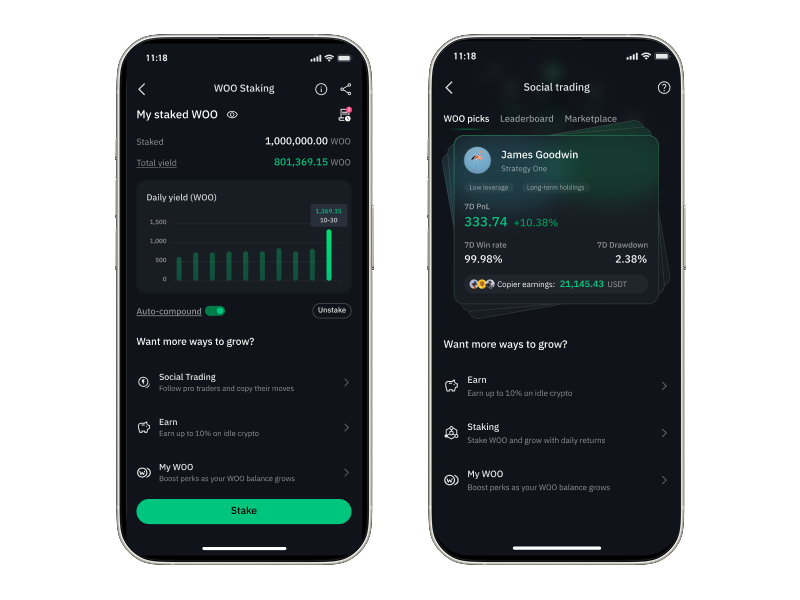
Cross-sell
Added a "Want more ways to grow?" section to Staking and Social Trading pages. When users are not engaged with the current product, cross-sell surfaces relevant products to keep them on the platform.
- 22.5% click rate from Staking page
- 25.2% check LT details from Earn
- 49.7% check earn details from Social Trading
Show Earn in Withdrawal / Deposit
Surfaced Earn product information during the deposit and withdrawal flow. When users intend to move funds out, a contextual prompt encourages them to earn yield instead — reducing withdrawals and growing AUM.
- Go to Earn instead: 5.13% → 13.1%
- Overall conversion rate: 0.79% → 1.19%
- Select time reduced: 5s → 3s
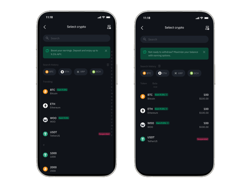
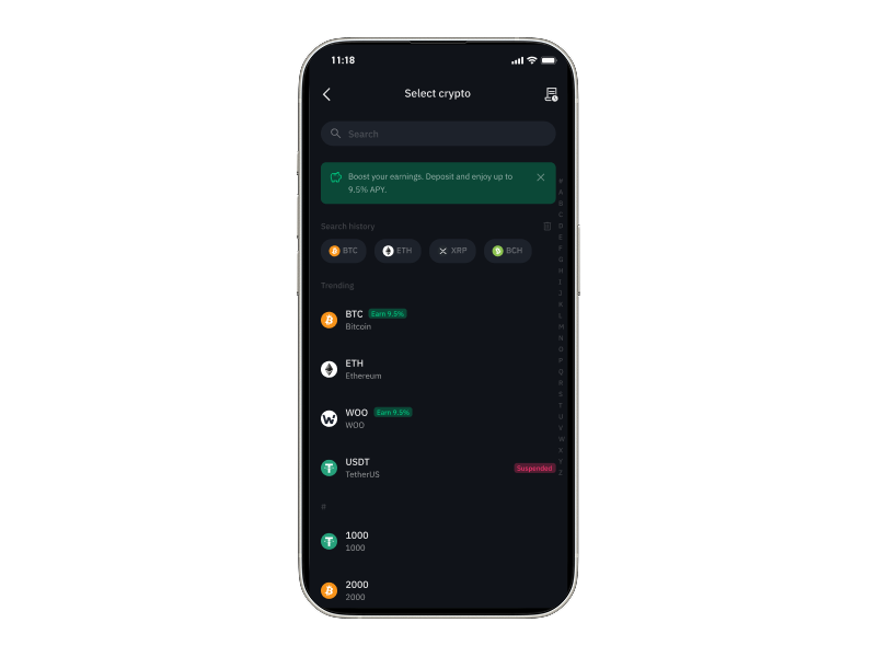
Category in Deposit Page
Restructured the Select Crypto page with Trending and categorical groupings, making it faster for users to locate the token they want to deposit.
- Added Trending category for quick token discovery
- Reduced scanning time in the deposit funnel
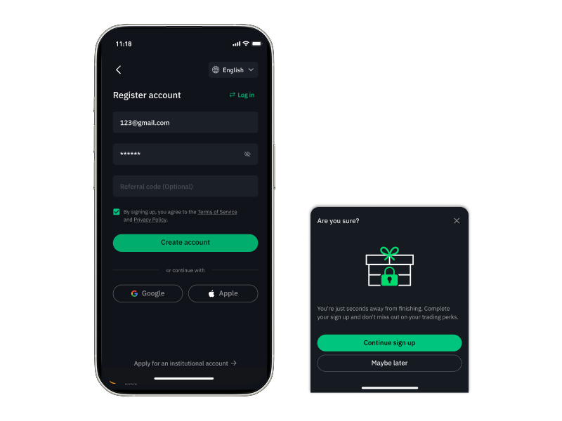
Register Reactivation
Introduced a retention modal triggered when users attempt to abandon the registration flow. A timely nudge — "You're just seconds away from finishing" — brings users back to complete sign-up.
- Exit-intent modal with high-contrast CTA
- Drives registration completion and grows the user base
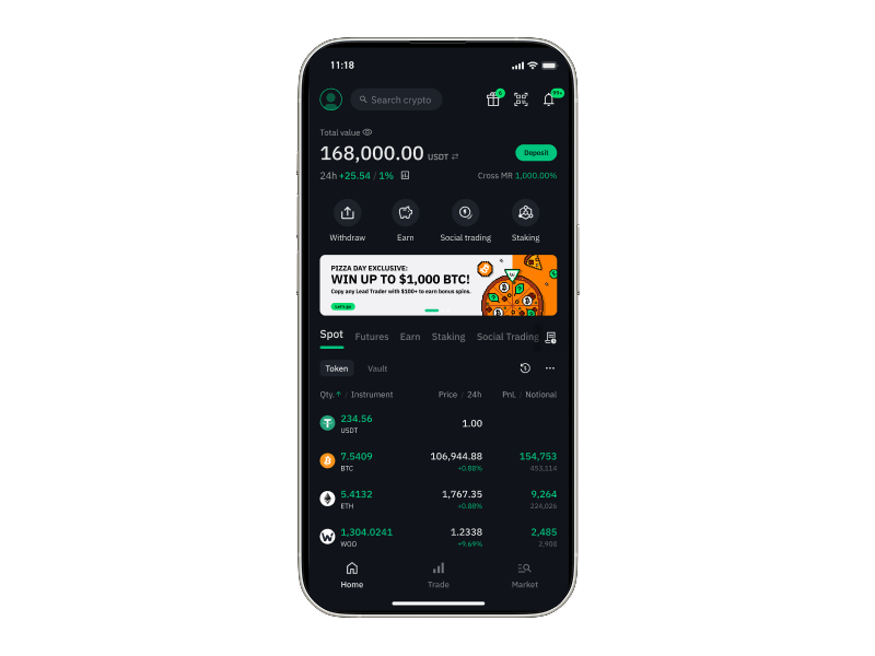
Home Page Revamp
Revamped the home page layout by combining Deposit and Buy Crypto, and replacing account-switching with a search bar for faster token access. A/B tested and rolled to 100%.
- 12.2% search bar click rate
- 63.9% enter trade page from search
- Staking view rate: 7.61% → 11.9%
- Buy crypto rate: 1.71% → 1.8%
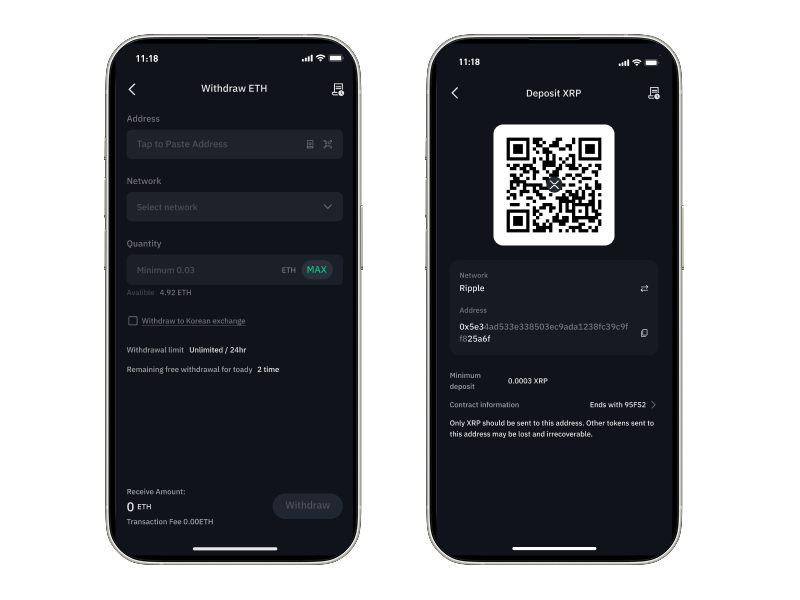
Withdraw / Deposit Page UX Improvement
Revamped the withdraw and deposit page UI to align with the latest design system and improve usability — reducing the time users spend completing transactions.
- Withdraw process time: 1m13s → 0m52s